App Design That Starts With How People Actually Use It
Most apps do not fail in the code. They fail in the assumptions made before a single screen was drawn. We spend the first weeks talking to your users, sketching the flows in wireframes, and testing a clickable prototype — so what gets built is something people can finish without a tutorial.
User Research
Interviews, session recordings, and funnel data turned into a clear picture of who uses this and what gets in their way.
Wireframes
Structure first, styling second. Low-fidelity layouts settle the argument about hierarchy before anyone debates a color.
Prototypes
A clickable, high-fidelity build with real transitions and states, ready to put in front of customers on a phone.
Usability Testing
Watched sessions, honest reactions, and a ranked list of what to fix next. Nothing ships on instinct alone.
Interfaces Built From Evidence, Not Instinct
Every screen we hand over has a reason behind it. These are the numbers we hold ourselves to once a product is in front of real users.
Average lift in task completion after a single round of moderated usability testing and a redesign of the blocking screens.
Usability interviews or watched sessions pulled per research round, with the same script every time.
Typical turnaround on a clickable prototype you can send to customers or hand to a developer.
Median jump in average app store rating after an onboarding and first-run rework.
Design revisions built into a standard engagement, so testing findings actually land in the files.
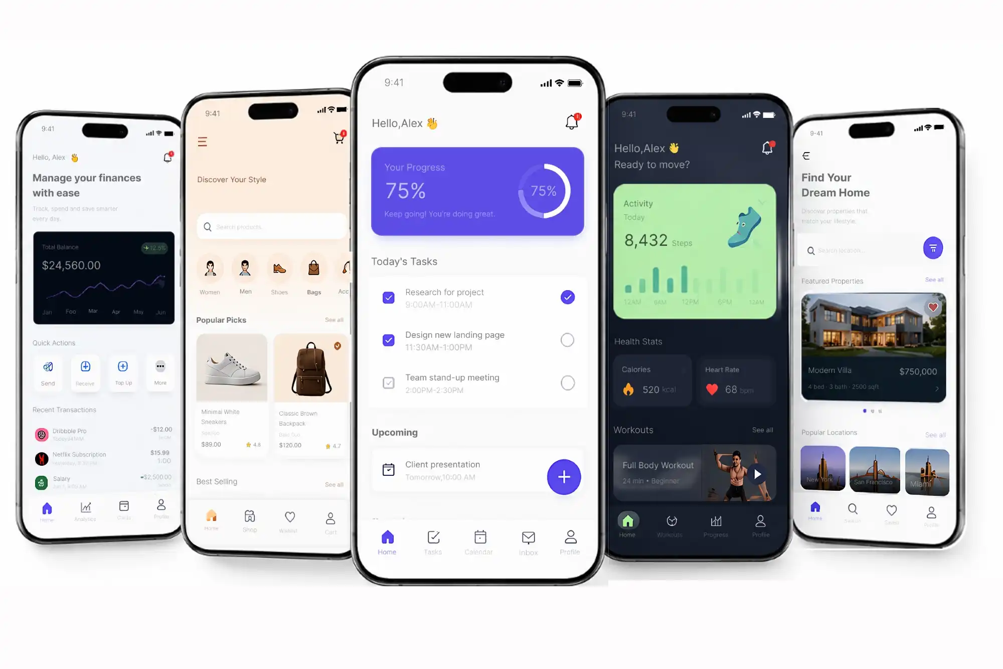
Start With Users, Not With Screens
A layout drawn from intuition is a guess with good typography. We spend the opening phase talking to the people who will actually use the product — customers, staff, whoever handles support today — and reading the numbers your current product already produces. What comes out of that is a ranked list of jobs to do, in the order users need them.
- Stakeholder and user interviews, transcribed and shared with your team
- Personas and journey maps built from what people actually said, not from the org chart
- Competitive teardown of the three products your users compare you against
- Analytics review covering drop-off points, task time, and repeat behavior
- A written findings document that the product, design, and engineering leads all agree on

Test It on a Phone Before Anyone Codes It
Once the structure holds up, we build the real thing in design: production screens, the full component set, and a working prototype with transitions, loading, empty, and error states. Your team clicks through it on an actual phone. When people stop hesitating, the design is ready for a build sprint — and expensive rework happens on a Figma file instead of in a codebase.
- High-fidelity screens with the type scale, spacing, and color tokens your build will use
- Every component drawn in its normal, empty, loading, and error condition
- Prototype links tested on real devices before they reach your stakeholders
- Motion and handoff notes for transitions that are hard to guess from a static screen
- Redlines and specs ready to drop into the sprint your engineers are already planning
Six Pieces of Work, One Coherent Product
You can hire us for a single focused piece or for the full path from first interview to a system your team can keep extending.
User Research & Discovery
Interviews, contextual observation, survey review, and a competitive teardown, distilled into personas, journeys, and a prioritized problem list. This is the part most teams skip, and the part that makes everything after it faster.
Architecture & Flows
Navigation, screen inventory, content hierarchy, and the edge cases that usually surface two months into a build.
Wireframing
Low-fidelity layouts for every primary flow, built fast and reviewed in the open so the structure is right before any styling lands.
Visual Design & Systems
Final screens plus a real design system: tokens, type scale, spacing rules, and a component library in Figma your developers can pull from.
Interactive Prototypes
Clickable flows with working transitions and states, so stakeholders, sales, and QA can all react to the same thing.
Usability Testing & Accessibility
Moderated sessions with real users, a severity-ranked report of what broke, and an accessibility pass against WCAG 2.2 AA — contrast, tap targets, focus order, and screen reader labels handled as we design rather than after launch.
Five Steps, No Mystery
You always know which step we are on, what we need from you, and what comes out of it. Reviews happen in the browser, not in a slide deck, and every step ends with something you can look at.
-
01
Listen
A kickoff with your team, then interviews with users and anyone who touches the product day to day. We read your analytics and support tickets, and we tear down the two or three apps your users actually compare you to.
-
02
Map
Findings turn into journeys, an information architecture, and a screen inventory. We agree on what ships in the first release and what waits, so the design matches the roadmap instead of fighting it.
-
03
Sketch
Low-fidelity wireframes for every core flow, reviewed live with your team. Cheap to change, which is exactly why we settle structure here, while changing it still costs nothing.
-
04
Prototype
High-fidelity screens and a clickable prototype with real transitions, loading, empty, and error states. People use it on their own phones, and you get a link, not a PDF.
-
05
Prove & Hand Off
Moderated testing on the prototype, two rounds of revisions built in, then annotated files, tokens, and specs. We sit with your developers during the first sprint and answer what the file could not.
App Design Work, Answered Plainly
Design It Properly the First Time
Tell us what you are building and we will walk you through the research, the screens, and the timeline in a short, no-pressure call. No jargon, no obligation.
Start the Conversation